4 Components W.I.P.
It is important that our components are structured consistently. We define the following rules for building components.
Every file is a module.
Every module exports one main “default” component.
Modules are allowed to define sub-components; however, these are local (not exported).
What the component is; where it lives; and why we have it.
An ASCII picture of the main component.
A table with every state of the main component, the condition for that state, and a high-level description of the associated styles.
Accessbility considerations
A good example is the ProgressDots component, which begins as follows:
|
ProgressDots: a phase-seperated row of dots that live in the top-bar |
|
which indicate progress through the cards. |
|
<- Discovery oooo - Calibration o - Activation oooo -> |
|
Each phase of dots is composed of a label and an array of dots. |
|
The label has two states: |
| Active | if a card with its phase is in view | white | |
| Inactive | otherwise | muted white | |
|
Each progress dot has three states: |
| Active | if its card is in view | petrol border | |
| Inactive | if its card is not in view | white border | |
| Completed | if its card has been completed | petrol fill | |
|
Accessiblity considerations: N.A. |
The rule of thumb for the implementation of each component is to keep the mapping well-defined from state to view. This is illustrated in the table above for the progress dots.
4.1 Card View
The prinicple component of the game is the card. The “Card View” is how we view cards. Generally it is seperated into two panels: the “Context” panel and the “Question” panel. Together, they look like this:
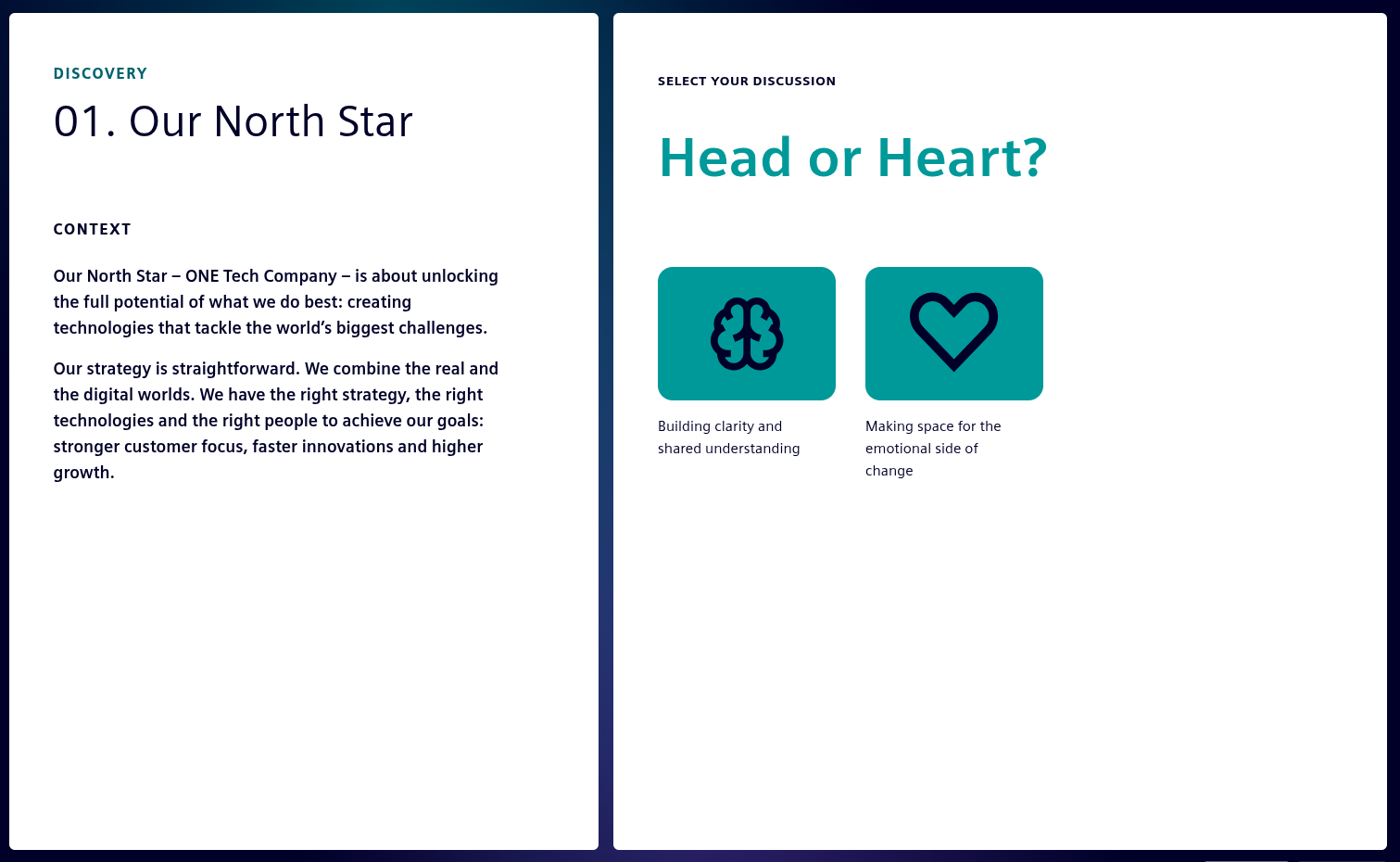
To understand our components, like the Card View, we are going to start from their apperance “in game” and work backwards to the data-structures that define them.
4.1.1 Context Panel
Let’s consider our panels seperately, starting with the Context Panel.
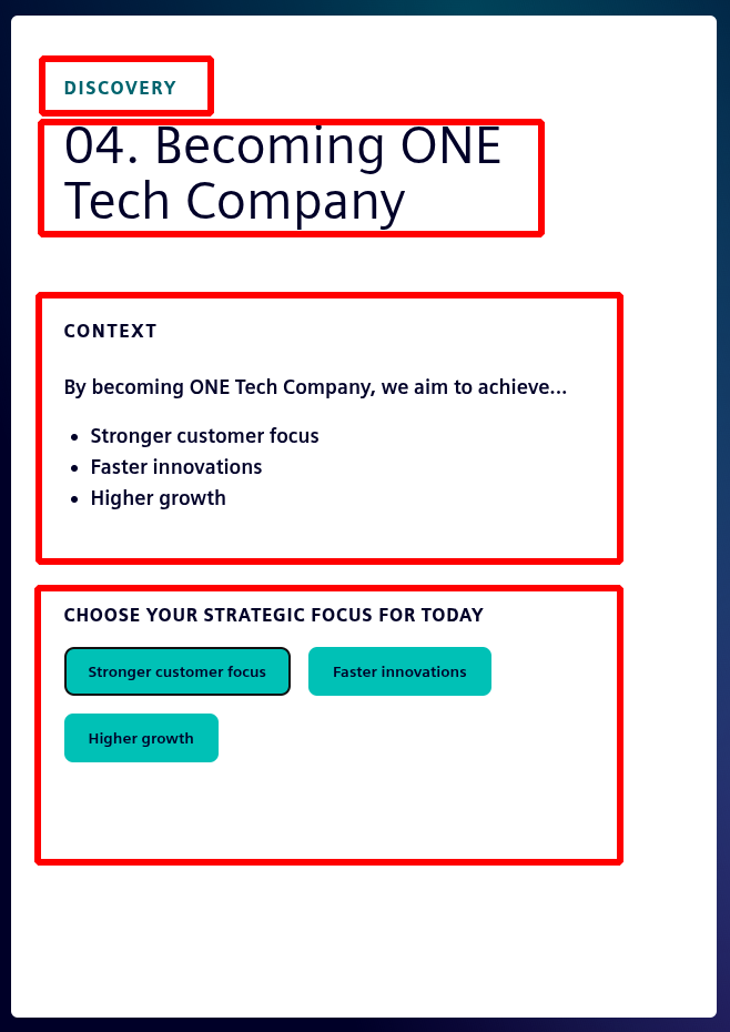
The context panel needs to display the:
phase, index, title and context of the current card;
and a selection box which is either empty or populated with pills. each representing a pathway
4.1.2 Question Panel
The question panel has two phases: the first prompts the user to select a question; the second displays the selected question. If there is only one question to be selected, the first phase is bypassed. The two phases of the question panel are shown below, in order:
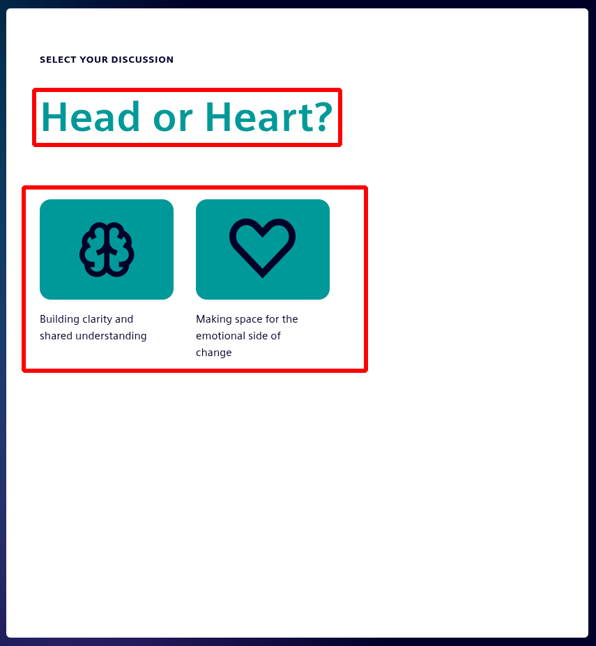
Here we have a:
question “Head or Heart?” derived from the available questions;
and buttons that link to those questions.
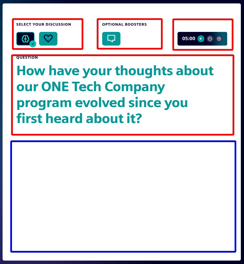
From left to right, top to bottom, we have:
buttons to change question selection
buttons to activate optional booster
the card timer
the content of the selected question
a section filled with the booster if selected
If we choose to select a booster, the question text will shrink to a smaller size and that booster panel will open in the area bordered blue.